

Overview
My objective in developing the Jobsite Shuttle Dolly website was to design an interface that proficiently conveys the advantages and characteristics of the product to potential users. By employing the principles of user interface design, my aim was to offer a natural and smooth navigation experience for visitors. The website is intended to present information in an unambiguous and succinct way, simplifying the process for users to comprehend the product's capabilities and how it can be useful to them on a job site.
Role: User Interface Designer
Deliverables: Proposal/Prototype
Tools: Figma
Duration: 2 months
Project Goals
For the development of the Jobsite Shuttle Dolly website, my goal was to create an interface that effectively communicates the benefits and features of the product to potential users. Utilizing the principles of user interface design, I aimed to provide an intuitive and seamless navigation experience for visitors. The website is designed to present information in a clear and concise manner, making it easy for users to understand the product's capabilities and how it can benefit them on a job site.
Process
Proposal
At the beginning of this project, I created a proposal that outlined my plan to implement various laws and principles of user interface design in my final product for the Jobsite Shuttle Dolly website. My proposal detailed how I intended to utilize each UI principle in my final design. You can access the link below to review my project proposal and gain a more comprehensive understanding of how I planned to incorporate each UI principle.
User Interface Principles
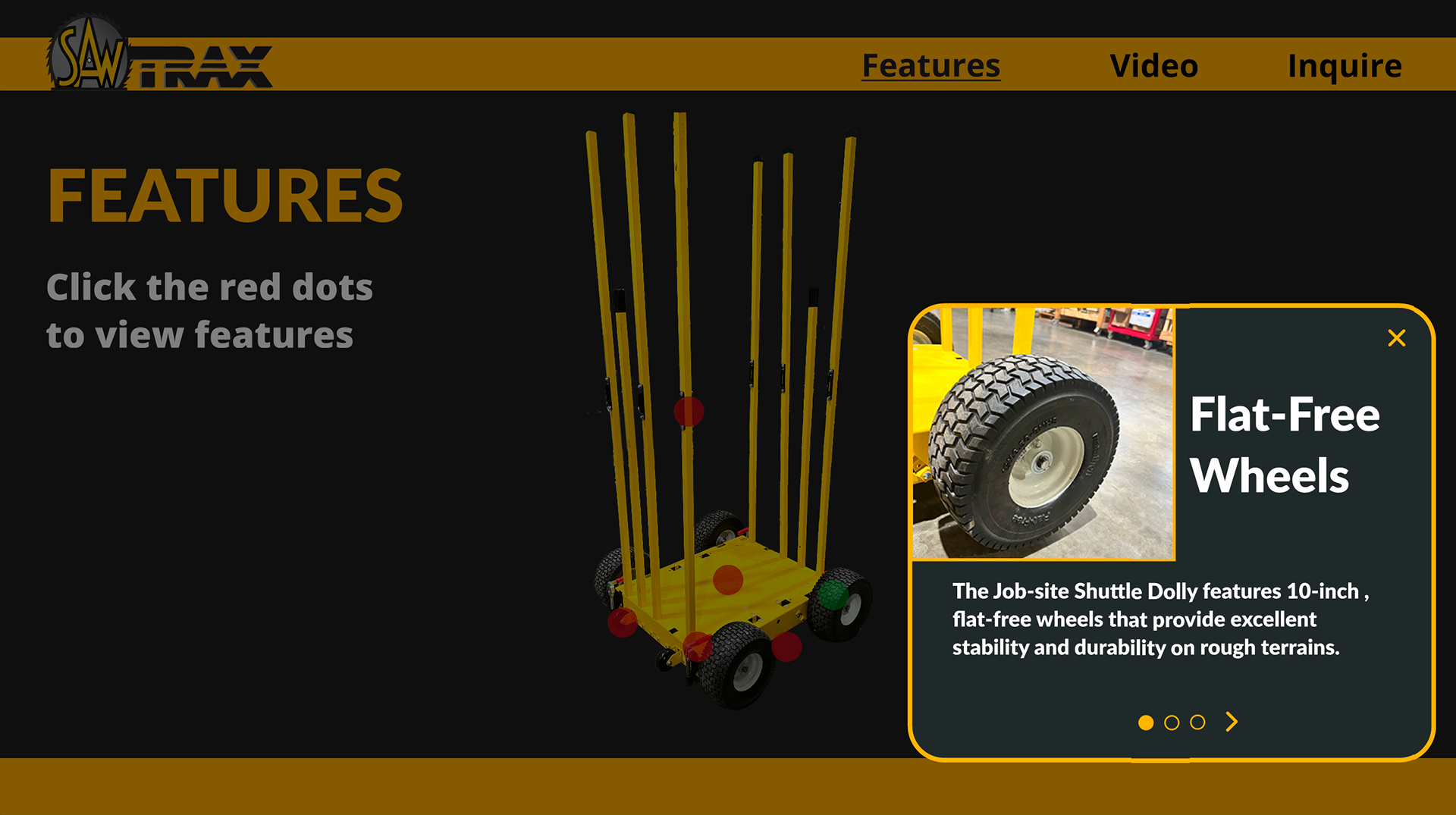
Spatial Contiguity Principle
States that humans learn best when relevant text and visuals are physically close together.
The website's layout makes information relationships clear. The dolly's visuals accompany its technical specifications.
s
Signaling Principle
Refers to the finding that multimedia learning materials become more effective when cues are added that guide learners' attention to the relevant elements
The website directs users through content with clear and straightforward signaling. It employs strong font and varied colors to highlight significant information and split up the content using headings, subheadings, and bullet points.
s
Miller's Law
The number of objects an average person can hold in working memory is about seven
"People's working memory is limited." By simplifying difficult material, the website would reduce user cognitive strain.
Used short points rather than one large, complex piece of text, ensuring usability even with numerous activities.

Final Prototype
Conclusion
Upon completion of this project, I gained a deeper understanding that designing an effective interface involves more than just focusing on aesthetics. By utilizing principles of cognitive psychology and memory retention, we can create interfaces that are intuitive and user-friendly, while minimizing cognitive load on users. Moving forward, I will incorporate these learnings when designing more complex interfaces in the future.


